Detail widget
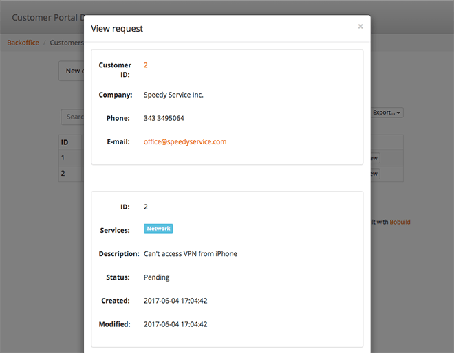
The Detail widget shows the fields of a single record — the read-only counterpart to a form. It is usually placed on sub-pages opened from a grid, so operators can inspect a case, a customer, or an order without editing it.
Typical scenarios:
- a case summary beside an edit form on the same page;
- a printable-style overview of linked data for support staff;
- a dashboard strip of KPI cards (totals, status, deadlines) above a denser form or grid;
- showing related reference lists as badges or bullets for quick scanning.
Fields and layout
Add the fields you want to display. You can set labels for each field. Optionally enable Hide empty fields so blank values do not clutter the view.
For Long Text fields, Truncate after n characters shortens the display with a control to expand the full text. For File fields, Open as can show PDFs in a modal or side pane (same options as grid File columns); non-PDFs still download.
Layout controls how those fields are arranged:
| Layout | Best for |
|---|---|
| Horizontal | Dense summaries — label beside value |
| Vertical | Stacked profile-style cards — label above value |
| KPI Cards | Dashboard metrics — each field as its own card with optional icon |
KPI Cards
Choose KPI Cards when the detail should read as a scoreboard rather than a form-like list: open tickets count, revenue this month, next deadline, approval status, and similar highlights.
Typical scenarios:
- a case header showing status, assignee, and days open at a glance;
- a customer overview with lifetime value, open orders, and last contact date;
- a portal home strip of personal metrics before the full grid of records.
How it behaves:
- each field (or action button) becomes a card in a responsive row;
- set an optional Icon on the field settings (icons are available only in KPI Cards layout) so metrics scan faster;
- the label sits in the card header next to the icon; the value is emphasised below;
- field groups introduce a visual break between sets of cards (for example “Status” metrics vs “Money” metrics);
- label-only items (no bound field) render as section headings within the card strip;
- links and delete actions still work — action items appear as button-style cards;
- display rules (colours, rename, hide) apply as usual so overdue KPIs can turn red automatically.
Link to a pre-filtered grid
When a KPI (or other detail field) links to another page (not :view / :edit), you can add Also filter the destination: rules that seed URL user filters on the destination page (same idea as a grid’s default filters, limited to query-string-capable ops). Literals and comparisons to the current detail record are supported.
Optionally Scope to widget with a destination widget id so params become ?<viewId>.field= instead of applying to every matching widget on that page. When link filters are set, the href is a list deep-link (no leaf record id).
Typical pattern: a “Open tickets” KPI opens the tickets grid already filtered to status=open (and optionally to the current customer).
Keep KPI Details focused on a handful of high-signal fields. Put the long narrative and full field list in a second Detail (or Form) with Horizontal/Vertical layout on the same page.
Reference and Reference Array fields
- Display field — which field of the linked record to show (name instead of raw id)
- For Multiple links (Reference Array) and other array-style values, Display items as Badges or Bullet points
That keeps dense relationship data readable without opening every linked record.
Display rules
Display rules can emphasise or hide values based on the record — for example colour overdue statuses or hide empty optional fields.
Actions include Set Color, Set Label Color, Set Background Color, and hide/show-style rules similar to forms, so a detail view can highlight what needs attention without opening the edit form. On KPI Cards, colour rules are especially effective for calling out metrics that need action.