Form widget
Forms can be used to insert new records or to update existing records. Your app can have as many forms as you want, even for the same objects: for instance, you might want to provide different forms for different users or for different purposes.

How to create a form widget
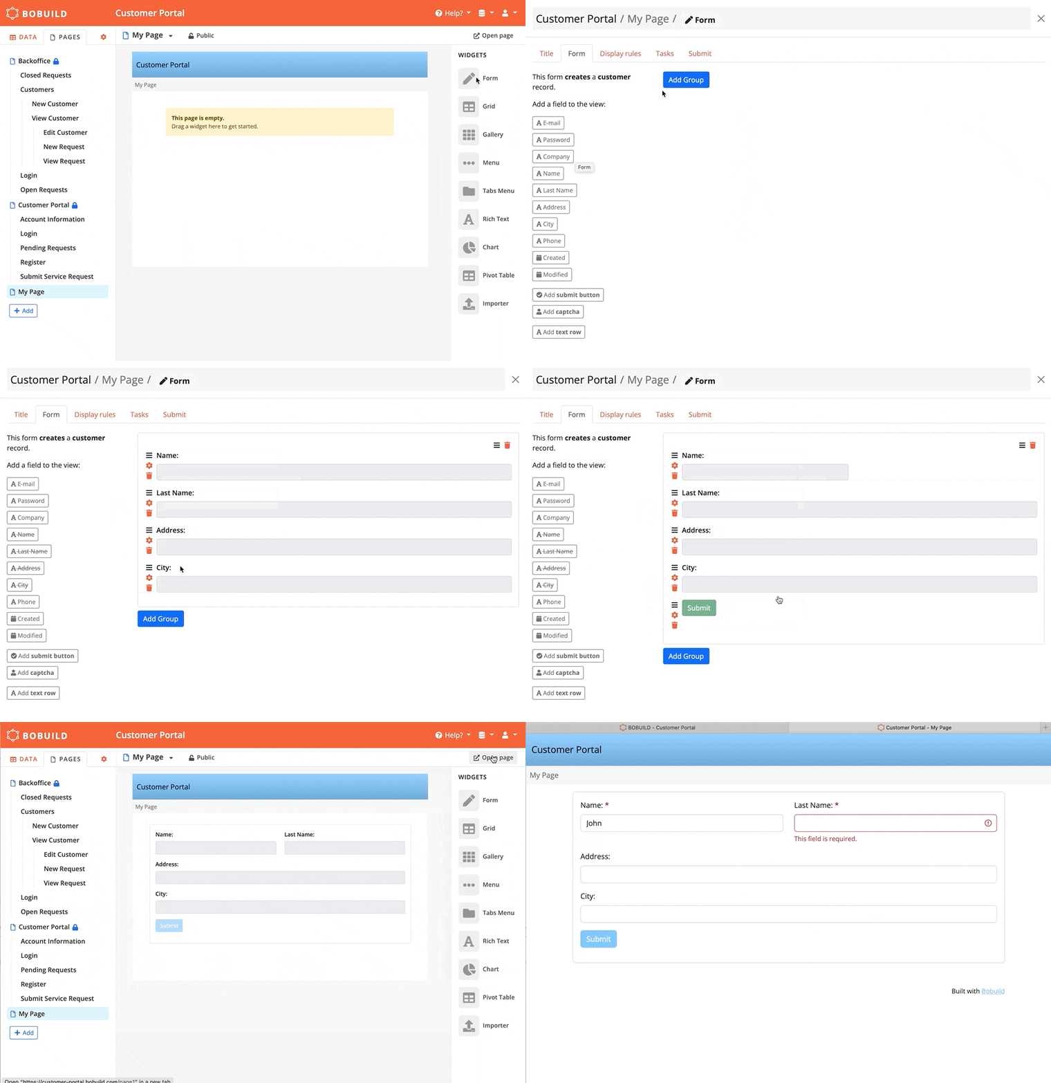
- Drag a form widget into a page.
- Use the dropdown menu to select the desired behaviour of the form (create a new record or update an existing one) and the object you want to create or update. The dropdown will only list the actions that are allowed in that specific page: for instance, if the page does not refer to any specific record the dropdown will not list the update action.
- Configure the form widget by selecting the fields you want users to update.
General options
Like other widgets, you can optionally set a title and a subtitle that will be displayed above your form.
In addition, you can define visibility rules which determine whether, based on the conditions you define, the widget shall be displayed or not. For instance, you might want to hide a contact form for orders that are marked as completed.
For multi-step wizards, use a dedicated Stepper widget with several forms (one visible per step). The older form Display as → stepper mode is deprecated and no longer offered for new forms; existing apps that still use it should migrate to the Stepper widget.
Form fields
In a form, you can use any number of fields according to what data you want to let your users enter (or even no fields at all if you just want to show the submit button to create an empty object or run tasks).
For each field, you can set the following options:
- Label: the label of the field, as it will appear in the form.
- Instructions: additional text that will be displayed next to the form field. You can use this to provide more context about what data you expect users to enter.
- Required: this option will mark the form field with an asterisk, and prevent form submission if the field is not filled with data.
- Read-only: this option will grey out the field preventing its value from being set by the user. Use this to display a value without allowing edits — on update forms for the current record value, or on create forms when a live formula should be visible but not edited.
- Default value: on create forms, start from a fixed default or the field's global default; on update forms, you can keep the current value or force a default when appropriate.
- No default / require choice: on create forms, for boolean and number fields (not ratings), start empty instead of
0/ No. The user must choose a value before saving. For Yes/No, either answer counts (unlike Required, which means Yes). Checkbox-style Yes/No fields are shown as radios when this is on. - Width: width of the field inside the form (
100%,75%,50%,33%, …) so you can build multi-column layouts. - Min items / Max items: for Multiple Choice and Reference Array fields, require or cap how many values can be selected.
- Live formula: compute the field value in the browser as other form fields change (see Live formula).
You can also add the same object field more than once on a form — for example to show a read-only copy beside an editable one, or to repeat a value in a multi-step layout.
- How to configure it in the builder
- How it looks like in the resulting app
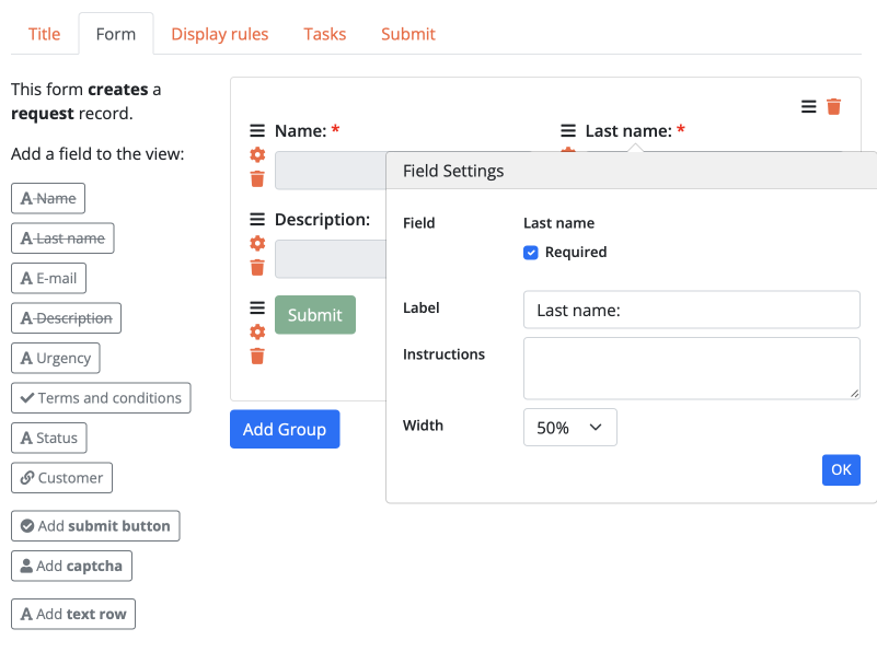
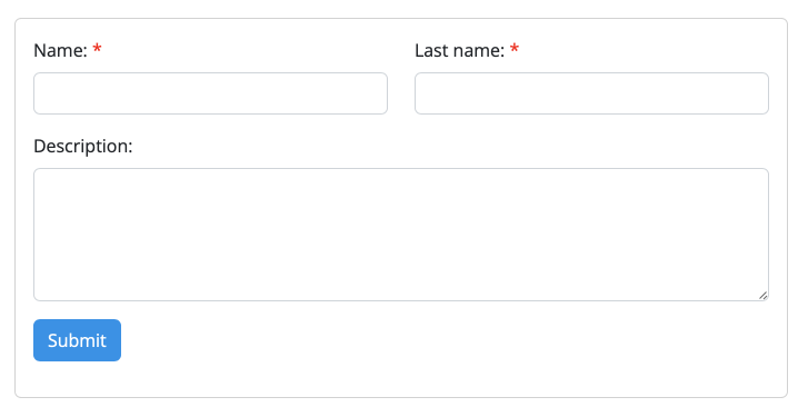
The form widget itself also has a Width setting (on the widget title tab) — 100% down to 16% — so a form can sit beside another widget on the same page.
Live formula
A Live formula fills a form field in the browser as the user types — totals, concatenated labels, derived dates — without waiting for submit. Unlike auto fields, the value is calculated on the form itself and is saved only when the form is submitted (as a normal field value).
Typical scenarios:
- line total = unit price × quantity;
- a preview label built from several text fields;
- a boolean flag derived from other answers on the same form;
- a label that includes a field from a linked record selected on the form (for example the author’s name).
How to configure
- Open the form field settings for the target field.
- Enter an expression in Live formula.
- Reference other fields on the same form with
{field}placeholders, or one hop through a Reference field with{reference.field}(for example{author.name}).
Available on text, number, boolean, and date/time fields that are editable (not password fields).
Expression syntax
The expression is evaluated as JavaScript. Each {field} is replaced with the current value of that field on the form. For a Reference field on the form, {author.name} uses the related record’s name (text, number, boolean, or date/time — not password fields, and not multi-hop paths like {author.publisher.name}).
| Expression | Description |
|---|---|
{price}*{qty} | Line total from two number fields |
{year}+'-'+{month}+'-'+{day} | Build a date string from parts |
{firstname}+' '+{lastname} | Full name preview |
{author.name}+' - '+{title} | Linked author’s name plus a field on this form |
Rules to keep in mind:
- Only fields that appear on this form can be referenced (and not the field itself).
- Dotted paths are one hop through a Reference field that is on the form (not Reference Array).
- Placeholders inside quotes are not interpolated — write
{a}+'-'+{b}, not'{a}-{b}'. - If the target field is editable, the user can overwrite the computed value; it is recalculated again when a dependency changes.
- Mark the field read-only when you want a pure calculated display that users cannot edit (however keep in mind that read-only fields are intentionally not saved to the database - for that, you'll need an Auto field).
Use a live formula when the calculation only needs values currently on the form and you want instant feedback. Use an auto field when the result must be stored and kept up to date from related records, other objects, or server-side placeholder functions. Step-by-step: Line total with a live formula.
Display rules
Display rules change the form as the user types — show the right fields, enforce constraints early, and highlight status — so people finish in one pass instead of discovering errors after submit.
For example, show a "Company Name" field only when the user selects "Company" in a "Type" dropdown:
- How to configure it in the builder
- How it looks like in the resulting app
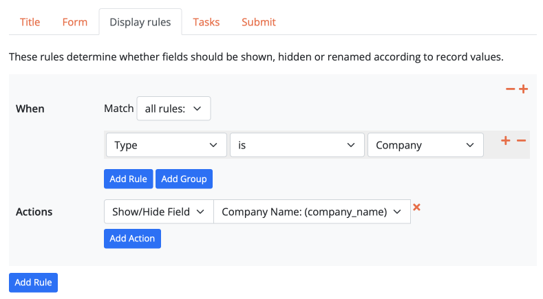
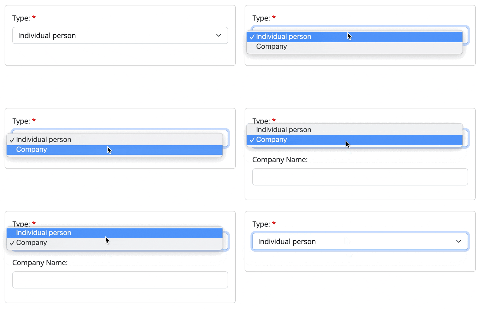
Available actions for display rules include:
- Show/hide: the selected field will be shown if the configured condition is true, and hidden otherwise.
- Hide/show: the selected field will be hidden if the configured condition is true, and shown otherwise.
- Set required: the selected field will be made required if the configured condition is true, and optional otherwise.
- Set read-only: the selected field will be made read-only if the configured condition is true, and editable otherwise.
- Set read-only (all fields): make the entire form read-only when the condition matches.
- Rename field: the label of the selected field will be changed to another value if the configured condition is true, and to the original value otherwise.
- Set Max Length: limit how many characters can be entered when the condition matches.
- Raise Validation Error: validate using values on the current form (see Validation).
- Set Color / Set Label Color / Set Background Color: emphasise or warn visually (for example highlight overdue fields in red).
Builder filters on display rules also support operators such as matches / does not match for flexible text checks.
Tasks
Tasks are actions that can be run when a form is submitted. For instance, you can use a form task to:
- send an e-mail to the user who submitted the form or to you;
- create a new record in another object;
- set values for other fields of the current record, as a way to provide defaults or to set them according to a conditional logic based on user's input;
- abort the save with a validation error when a check against other database records fails (see Validation).
A task is configured by selecting the conditions under which it should be run, and by configuring one or more actions to be performed. A form can have as many tasks as you want, that will be evaluated and run in the configured order.
Available actions for tasks include:
- Send email: send an e-mail to a fixed address (useful for notifying your team) or to an address taken from an object field. See Sending e-mail.
- Raise a validation error: abort the save after database-aware checks — see Validation.
- Update this record: set more values for the record that the form is creating/updating.
- Create a new record: create a new record in another object.
- Update a connected record: update one or more records in a connected object.
When a submit runs a heavy task graph (more than ten exploded actions, or any nested child task), Bobuild processes the save and tasks asynchronously and shows a progress indicator until follow-up redirect or message. Lighter submits stay synchronous.
Cancel button
Popup forms often need a clear way out without submitting. On the form’s submit button field settings, enable Show Cancel button.
When enabled:
- a Cancel control appears beside the submit button;
- it is shown only when the form is displayed in a popup window (on a normal full page it stays hidden);
- clicking Cancel closes the popup without saving.
Typical scenarios: quick “edit in popup” from a grid, create-related-record dialogs, or any modal form where users should abandon changes without hunting for the window chrome.
Follow-up
In the follow-up section, you can configure one or more rules to define where the user will be redirected after form submission. By default, the current page will be reloaded but you can select any other page of your app as a destination page. You can also define an optional message to be displayed on top to confirm the successful submission. These rules can be tied to conditions, so that you can redirect your user to different locations according to a configurable logic.
For forms that are creating or modifying a record of an object that is also being used on the target page as a user login object, you'll also have the ability to activate the Auto-login flag. In this case, the user submitting the form will be automatically logged in as the user of the submitted record. This can be useful in two situations:
- You are creating a registration form that creates your user login record, so you want the user to be logged in automatically upon form submission without having to authenticate.
- You have an internal portal for your operators and an external portal for your customers, and you want to let your operators login as customers to check what they are seeing in their area, thus bypassing their authentication.
Input Validation
Good validation stops bad data early, saves operators from cleaning up mistakes, and keeps workflows trustworthy. Bobuild gives you four layers — use the simplest one that fits the rule.
Typical scenarios:
- a phone number must not be blank and must stay within a length range;
- “Company name” is required only when Type is Company;
- start date must be before end date on the same form;
- a booking must not overlap another booking already stored in the database.
1. Field-level constraints
Set these on the field (object defaults and/or the form field settings). They apply as the user fills the form and again on submit:
| Constraint | Typical fields | Effect |
|---|---|---|
| Required | Any | Submission blocked if empty |
| Min length / Max length | Text | Character count limits |
| Min / Max | Number | Numeric range (enforced server-side as well) |
| Min items / Max items | Multiple Choice, Reference Array | How many values may be selected |
Start here for “always true” rules. They are easy to understand and need no display rules or tasks.
2. Conditional overrides with display rules
When a constraint depends on other answers on the same form, use display rules to change validation dynamically:
- Set required — e.g. require Company Name only when Type is Company
- Set Max Length — tighten length under certain conditions
- Set read-only — prevent edits when the record is locked
That way one form serves several cases without duplicating pages.
In display rules you can also use the matches / does not match operators to apply regex validation on textual fields.
Useful format-check examples (these verify the shape of the value, not checksums such as IBAN or codice fiscale control digits):
| Use case | Regex |
|---|---|
| Italian codice fiscale (individual) | ^[A-Z]{6}[0-9LMNPQRSTUV]{2}[ABCDEHLMPRST][0-9LMNPQRSTUV]{2}[A-Z][0-9LMNPQRSTUV]{3}[A-Z]$ |
| Italian partita IVA / CF (company) | ^[0-9]{11}$ |
| Italian IPA / SDI code (6 characters) | ^[A-Z0-9]{6}$ |
| Italian IBAN | ^IT[0-9]{2}[A-Z][0-9]{10}[0-9A-Z]{12}$ |
| French postal code | ^[0-9]{5}$ |
| French SIRET | ^[0-9]{14}$ |
| French IBAN | ^FR[0-9]{12}[0-9A-Z]{11}[0-9]{2}$ |
| Spanish DNI / NIF | ^[0-9]{8}[A-Z]$ |
| Spanish CIF | ^[ABCDEFGHJKLMNPQRSUVW][0-9]{7}[0-9A-J]$ |
| Spanish IBAN | ^ES[0-9]{22}$ |
| US ZIP code | ^[0-9]{5}(-[0-9]{4})?$ |
| US Social Security Number | ^[0-9]{3}-[0-9]{2}-[0-9]{4}$ |
| E.164 phone number | ^\+[1-9][0-9]{6,14}$ |
ISO date (YYYY-MM-DD) | ^[0-9]{4}-[0-9]{2}-[0-9]{2}$ |
| Email address (practical) | ^[^\s@]+@[^\s@]+\.[^\s@]+$ |
URL (http / https) | ^https?://[^\s]+$ |
| UUID | ^[0-9a-fA-F]{8}-[0-9a-fA-F]{4}-[0-9a-fA-F]{4}-[0-9a-fA-F]{4}-[0-9a-fA-F]{12}$ |
Prefer uppercase input (or normalise before save) for identifiers such as codice fiscale, IBAN, and SDI/IPA codes, since the patterns above are case-sensitive.
3. Cross-field logic on the form (display rule “Raise Validation Error”)
When the rule compares several values typed into the form — and does not need other rows in the database — add a display rule with Raise Validation Error:
- choose the field that should show the error
- set the condition (filters can combine multiple fields; operators include matches / does not match)
- choose Immediately (as the user types) or On submit
- write the message users will see
Examples: start date after end date; two password fields that must match; a checkbox that must be ticked when a total exceeds a threshold.
Prefer this layer when everything needed is already on the form. Users get feedback before or at submit, and a specific field can be highlighted. When the user edits the field that failed validation, the error message is cleared automatically.
4. Database-aware checks (task “Raise a validation error”)
Display rules cannot look at other records already stored in the database. For those checks, attach a form task with the Raise a validation error action.
Typical examples:
- a date range must not overlap another booking;
- uniqueness that spans two alternative fields;
- a sum that must match related rows or auto fields computed from connected data.
How it works: on submit Bobuild saves the record and runs form tasks in the same database transaction. If Raise a validation error runs:
- remaining task actions stop
- the transaction rolls back (the create/update is not kept)
- the configured message is shown in a dialog
Because the check runs after the temporary save, auto fields on the record are already computed and can be used in the task Conditions.
Configure:
- Conditions on the task — when to raise (often an auto field that counts conflicting rows)
- Error message — global message (not tied to a single field)
Use field constraints and display-rule validation for the common path; reserve task validation for rules that truly need the rest of the database. The same task action is available on API Create/Modify endpoints.