Grid widget
Grids can be used to show your data in a tabular way, with pagination and sorting. For each grid, you can define:
- which conditions will determine the records to be displayed;
- which columns will be displayed in the grid;
- which links will be available for each record, pointing to other pages where users can display or edit records;
- which actions will be available for batch tasks.
How to create a grid widget
- Drag a grid widget into a page.
- Use the dropdown menu to select which object you want to display in the grid.
- Configure the grid widget by selecting the fields you want to show as columns.
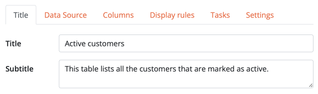
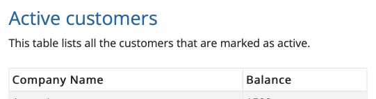
Title and subtitle
Like other widgets, you can optionally set a title and a subtitle that will be displayed above your grid.
- How to configure it in the builder
- How it looks like in the resulting app
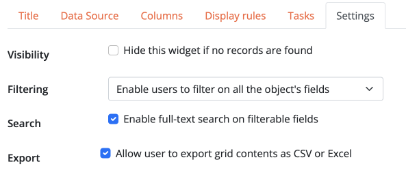
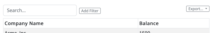
Appearance settings
The following options can be set to customize the appearance of the grid:
- Visibility determines whether you want the table to be hidden in case no records match the configured conditions.
- Filtering determines whether you want to let users filter the records on the fly according to one or multiple fields.
- Search determines whether you want to show a search box.
- Export determines whether you want to show a button to export data in CSV or Excel format.
- How to configure it in the builder
- How it looks like in the resulting app
Columns
In a grid, you can use any number of columns according to what data you want to display. Column titles and order can be customized.
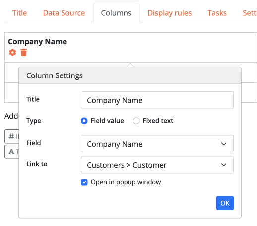
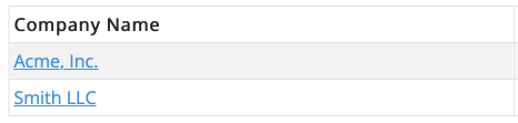
Linking to other pages
If you want to use one or more columns as links to other pages, you can optionally configure the link that the values will point to. This is useful if you want to provide a way for users to display or edit records. Unless you select a page that already exists, a new sub-page is automatically created for you when you configure the link.
- How to configure it in the builder
- How it looks like in the resulting app
Display rules
Display rules allow you to change the appearance of the grid dynamically according to record data.
- How to configure it in the builder
- How it looks like in the resulting app

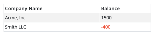
Available actions for display rules include:
- Set color: sets the text color of a cell or of the entire row if the configured condition is true.
- Set background color: sets the background color of a cell or of the entire row if the configured condition is true.
- Hide: hides the value of a cell if the configured conditions is true.
- Disable tasks: prevents the selection checkbox from being displayed for this record, thus preventing any batch task from being run on it (this only applies if tasks are configured for this grid).
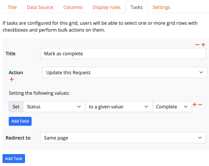
Tasks
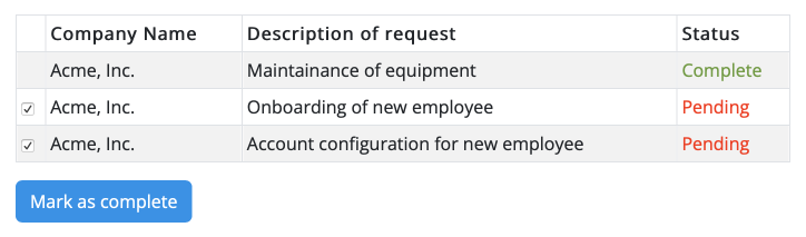
Tasks allow users to perform batch operations on multiple records at once. For instance, you can use a task to send an email to multiple customers, or to change record data. Tasks are displayed as buttons below the grid, and checkboxes will be displayed in the grid rows to let the user select the records they want to run the task on.
- How to configure it in the builder
- How it looks like in the resulting app