Chart widget
Charts turn live data into something stakeholders grasp in seconds — monthly intake, status mix, revenue by product — without exporting to a spreadsheet. Use them on dashboards and portal home pages so trends stay visible while the underlying records keep changing.
Typical scenarios:
- a backoffice home page showing open vs closed requests as a donut;
- monthly application volume as columns grouped by date;
- comparing two numeric series (submitted vs approved) on the same line chart.
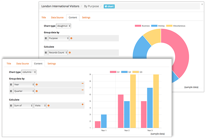
Chart type
| Type | Best for |
|---|---|
| bars / columns | Comparing categories side by side |
| line | Trends over time |
| pie / doughnut | Parts of a whole (keep slices few) |
Grouping and series
- Group data by one or more fields (categories on the axis or slices of a pie).
- Add one or more series (calculations). For each series, choose aggregation:
| Aggregation | Meaning |
|---|---|
| Record count | How many records fall in that group |
| Sum / average / minimum / maximum | Of a numeric field |
Multiple series let you overlay related metrics on the same chart.
Grouping by date
When the grouping field is a date (or date/time), set Date format on the group so the axis labels match the story you want:
| Format | Example use |
|---|---|
Full date formats (Y-m-d, d/m/Y, …) | Day-by-day detail |
Y | Yearly totals |
m/Y | Month within year (e.g. 08/2026) |
m, d/m, … | Other compact calendars |
Choosing Y or m/Y collapses many daily points into a readable trend — fewer crowded labels, clearer year-over-year or month-over-month views.
Layout
Set widget Width so a chart can sit beside a grid or KPI-style detail on the same page. Use Visibility rules when a chart should only appear for certain records or roles.